
Graphic Designer Knowledge
MODULE 1
MEDIUM LEVEL
Valencia INNOHUB
Unit 1: Introduction to Graphic Design
AIMS & OBJECTIVES
The purpose of the presentation is to study and learn the fundamentals of graphic design, its foundations and basic elements, in order to comprehend its uses and applicability.
LEARNING OUTCOMES
LOut1: Learn what graphic design is and what are the advantages of acquiring knowledge in this topic.
LOut2: Evaluate a proper use of the elements in graphic design.
LOut3: Understand the main foundations of image creation and typography regarding graphic design.
KEYWORDS
- Graphic Design
- Communication
- Image creation
- Colour
- Harmonic Composition
- Typography
- Bitmap
- Vector
- Open source software
TABLE OF CONTENTS
- AIMS &OBJECTIVES
- LEARNING OUTCOMES & KEYWORDS
- Introduction
Definition
Graphic Design is one of the professions booming with the digitalization of many companies and activities, thus it is highly common to find a team of designers in any sector or business activity.
Graphic designers master the tools and knowledge necessary to visually convey messages, whether for informational or commercial purposes. They are experts in translating a company’s values and purpose into visual images, logos and other easily recognizable and striking resources.


But, why should I learn about graphic design?
üIt is a skill that is always going to be high on demand
üCompanies and businesses from every sector tend to appreciate knowledge in this field
üDesign and branding matter more now than ever
üYou will learn skills that a robot or machine could never do
üIt is pretty easy to learn, although hard to master
üIt can be transformed into a freelance activity if desired
Image is an essential visual component in graphic design. It plays an important expressive role. It is said that a picture is worth a thousand words, and it is, actually, true: our brain processes the content of an image faster than text.
Before you start any design, you have to keep in mind what information you want to communicate with your images. Choose them carefully and always keep in mind the core idea of what you are trying to express.
Now we are going to study the different elements and concepts that integrate image creation.

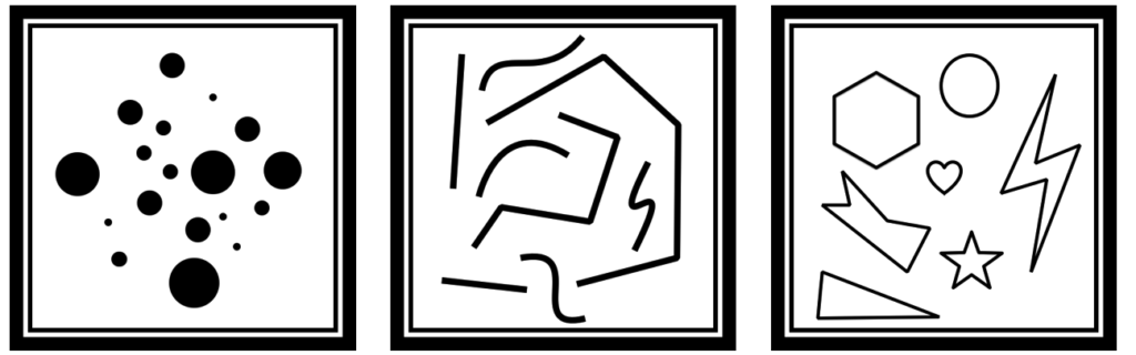
First things first. In graphic design there are several basic elements that make up visual communication and express a variety of messages. Let’s start with the point, line and plane, the basic forms of graphic design:
- The point is the basic graphic element and forms the minimum unit of visual communication.
- The line, which is nothing but a succession of several points in space.
- The plane, which is a set of lines that limit a shape.
Each of these elements has its own characteristics that allow them to be modified. The ones that predominate are:
- The form is defined by its precise arrangement and it is known as “object representation”.
- The direction is the projection of a form and reflects movement.
- The tone is the presence or absence of light.
- The colour is linked to the tone with the chromatic component, and it is the most emotional and expressive visual element.
- Optical or tactile texture is the surface character of visual materials.
- The scale is the relative size to the different shapes.
- The dimension is the capacity of an element to simulate a three-dimensional space.
- The movement is a very remarkable characteristic related to dynamism.

Now lets focus on colour. Colour perception is one of the most penetrating visual experiences we all have in common, and is a highly valuable source of visual communication. Understanding certain rules and knowing how to use them is crucial in order to create a good design.
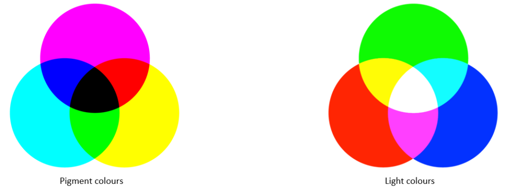
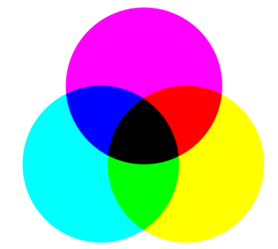
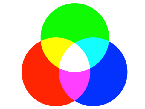
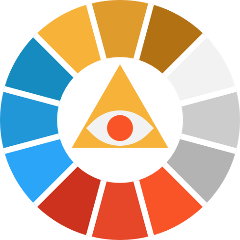
There are three main different types of colours: primary, secondary and tertiary. In the following graphics we can see the primary colours, divided into two groups: pigment colours (left) and light colours (right).
Pigment colours
Are Cyan, Magenta and Yellow (CMY, Cyan-Magenta-Yellow). This mixing is carried out by applying ink or other pigments. This process can be seen in offset printing. If you mix these three colours you get black. This is also known as subtractive mixing.
Light colours
Are Red, Green and Blue (RGB, Red-Green-Blue). This colour mixing is done on our digital devices. These colours become visible when the light mixture is projected onto the screen. If we mix the three colours at the same time we have light (white). This is also known as additive mixing.
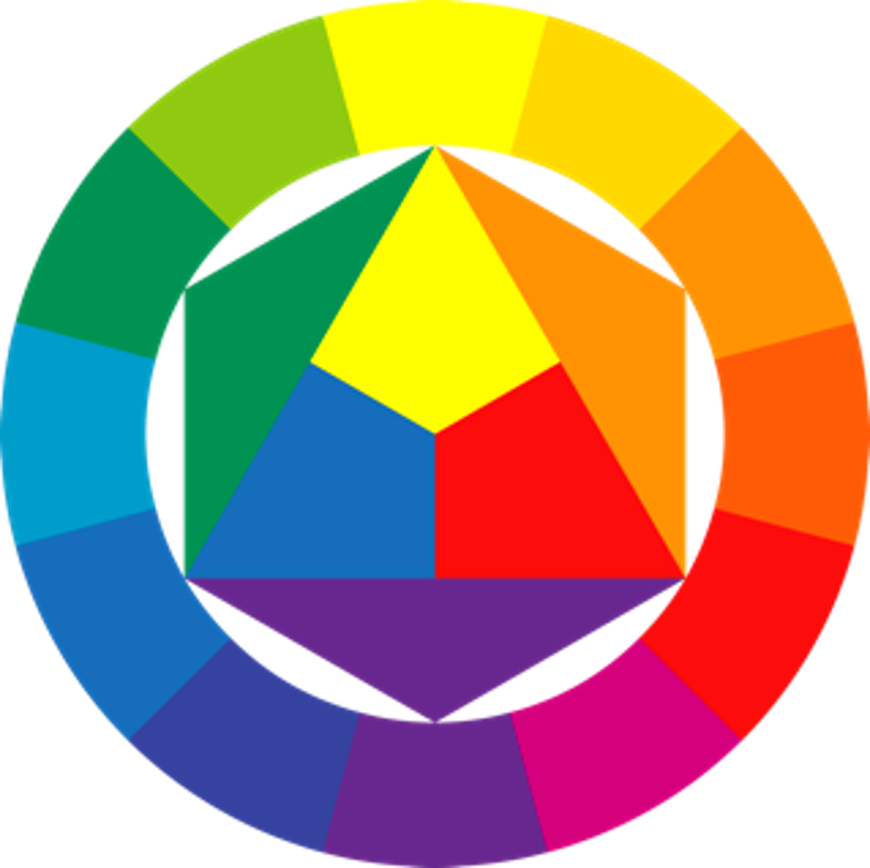
On the other hand, in this wheel we can see how primary colours, when combined, form secondary colours (for instance, blue and yellow form green), which can be combined again to obtain tertiary colours (green and blue form turquoise). This leads to an almost infinite spectrum!
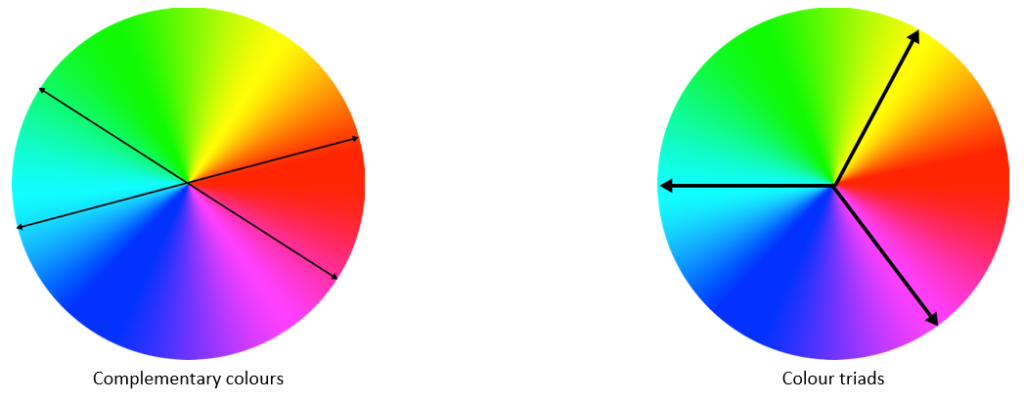
Colours can be grouped using different approaches. For example, opposite colours in the spectrum are considered complementary colours, whose combination generates impact and vibration. A pretty common combination of complementary colours is blue plus yellow, for instance.
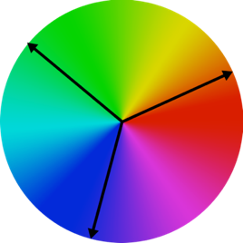
On the other hand, using equilateral triangles in the spectrum creates colour triads, whose combination is felt natural and dynamic by the human eye. We can see that RGB and CMY are, actually, colour triads.
Case Study no.1: Complementary colours and colour triads
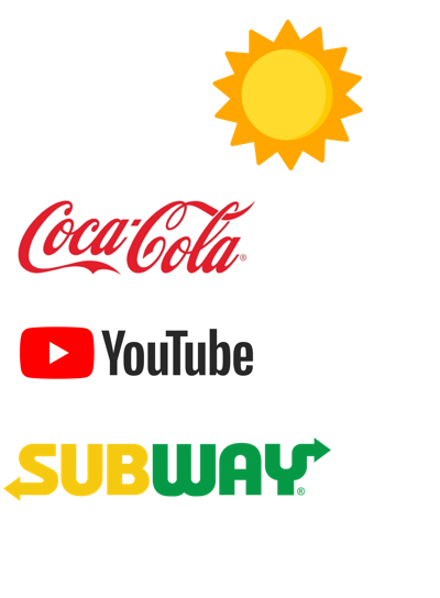
As we can see in this example (Fanta’s logo, a brand by CocaCola Company), a colour triad is used to achieve a perfect combination of colours.
Specifically, orange, blue and green are combined. These three colours combine each other naturally and create a pleasant image. On the other hand, it is important to notice the use of light in this logo, as colours are presented quite dark, in order to reduce the impact of the image.

Moreover, other groups and classifications can be made using the spectrum.
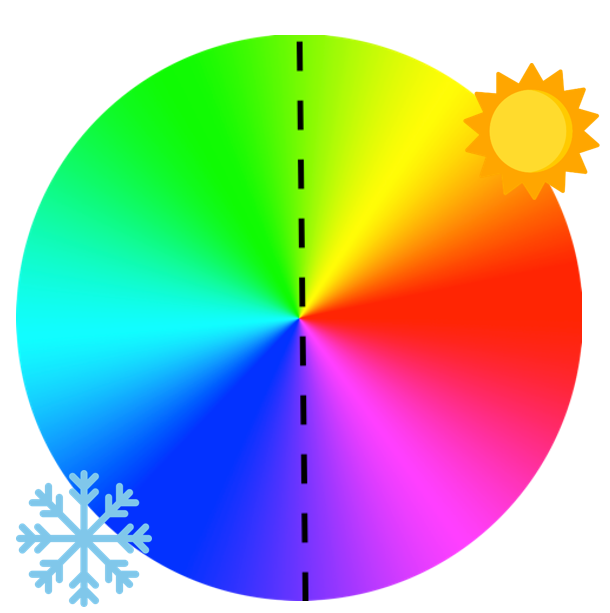
For example, we can divide the spectrum into warm colours, which are energetic, joyful and happy; and cool colours, which tend to be felt serious, light and distant.
Other sorting methods commonly used are bright and dark colours. Whilst the first ones tend to express purity and clarity, increasing the size of the plane they are being used into, the second ones are considered dense, instilling seriousness and maturity, and tend to reduce the size of the plane.
Case Study no.2: The use of warm and cool colours
As we can see, warm colours are used by brands that aim at a younger audience, or are related with non-formal contexts.
On the other hand, cool colours are used by professional or “serious” brands, normally related with business contexts.

Colours have a great emotional influence on human beings. For instance, they may be able to activate the memory, capture attention, suggest a change of attitude or motivate a decision. Each colour is related to a set of sensations and ideas.
The psychology of colour studies in detail the behaviour that the human brain assumes when it perceives different colours. The effects produced by colours often depend on cultural and environmental factors, and also on each person’s own prejudices. Not everyone sees colours the same way!
Black – Absence of light. It is the colour of prestige, courage and silence. It expresses nobility and elegance, seduction and mystery.
White – Presence of light. It represents life and purity. It expresses cleanliness, goodness, simplicity, gentleness, lightness, youth, peace, happiness, innocence, triumph and glory.
Purple – Associated with wisdom and respect. Its meaning is very much related to the spiritual and psychic world. It suggests abundance, intelligence, religiosity, dignity, tranquillity, mystery, aristocracy and passion.
Blue – It is associated with water and tranquillity. The feeling of placidity that blue causes is different from the calm of green. It expresses confidence, sincerity, commitment, professionalism, responsibility, fidelity, serenity, comfort and harmony.
Green – It’s the most peaceful and relaxing colour. It represents nature, health and life itself. It is associated with money, growth, abundance, fertility and freshness.
Yellow – It’s the brightest and most expansive. It is the colour of sun and light, violent, huge and intense. It expresses danger and caution. It can also reflect joy,optimism, modernity, enthusiasm, fun, strength, childhood, youth and luxury.
Orange – It is vibrant and contains an active force. It’s the colour of teenagers and expresses dynamism and fun. It denotes a cheerful and friendly character, welcoming, warm and stimulating .
Red – Associated with strong feelings. It suggests danger, alarm, rage, anger and violence. It expresses warmth and is linked to enthusiasm, intensity, vitality, audacity, courage, strength, love, passion and sexuality.
Pink – Traditionally associated with women’s issues. It expresses innocence, delicacy and romanticism. It manifests calm and tranquillity. The colour pink is used by companies that target a female audience, but in today’s modern society this traditional conception is disappearing.
Brown – It is a colour associated with humility, real, natural, rustic, earth and wood. It prints balance, comfort and weight. Coffee or chocolate brands use it frequently.
Composition is the arrangement of the different elements within the visual space in a balanced and orderly manner, in order to convey a message to the target audience. The success of a graphic project lies fundamentally in a perfect composition that is capable of transmitting an idea in a simple and direct way. Within the composition, aspects such as size, textures, colours, etc. come into play.
Thus, creating a composition is playing with the elements. We will be able to achieve different results and effects depending on the size, the place of disposition, etc., that we give them within the space.
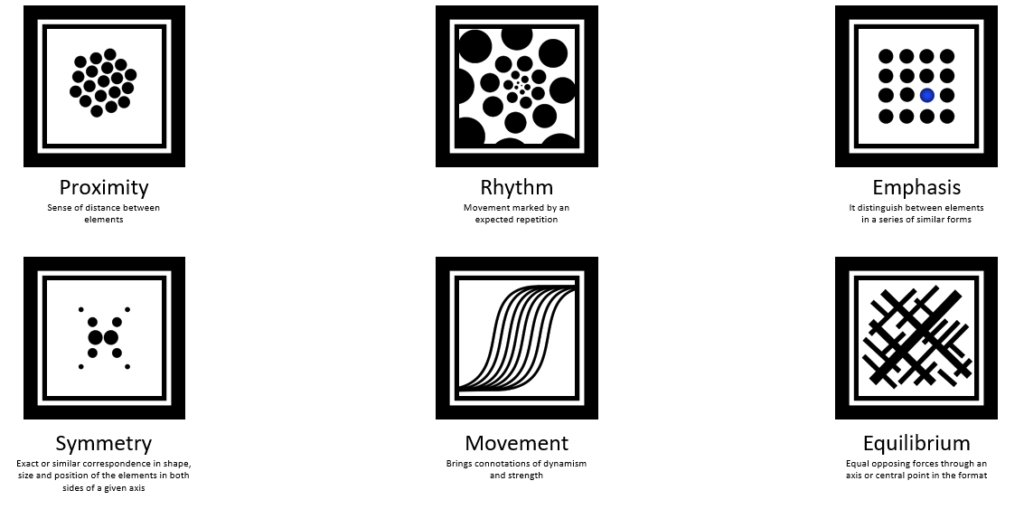
Although there are no strict rules for good composition, there are certain guidelines generally accepted by professionals. In the next slide we can see several composition concepts and an example of a proper use for each of them.

Case study no.3: Basic elements of harmonic composition
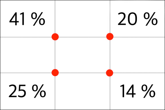
Now we will see the rule of thirds. It is commonly used not only in graphic design, but also in cinema, photography, painting and art in general.
It consists of dividing the plane into three rows and three columns. The points where the vertical and horizontal lines cross are the points of harmonisation. The horizontal axes provide stability, while the verticals facilitate the elevation of the look by marking preferences in the composition.
The percentages shown on this image correspond to the areas where most people tend to look at first. Focusing on those points can make a huge difference in your designs!
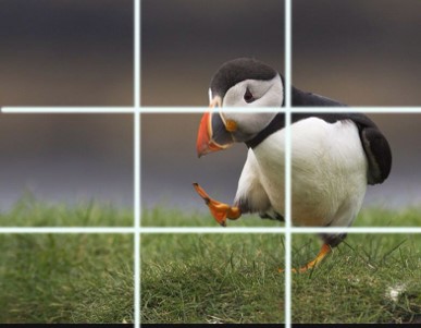
Case Study no.4: The rule of thirds
In this image we can clearly see the use of the rule of thirds, aiming at distributing the “weight” of the elements of the photo in a natural and pleasant way for the human eye. The grids above the image represent the “thirds” of the image.
Another element that we can analyse here is the movement inside the photo: the little penguin is walking to the left, thus the photo leaves that side completely empty. The human brain will be pleased with this fact, as the penguin has space to walk towards to.
Source of the image: https://ar.pinterest.com/pin/38913984255871368/?send=true
SYNOPSIS
As it is said, a picture is worth a thousand words.
Understanding the foundations of image creation is the key to success in the graphic design world: the proper use of colours, elements, harmonisation, the rule of thirds…
Your purpose has to be becoming able to communicate ideas, feelings, messages or even advertisements just using images and graphic elements. A correct use of the given elements can make the difference, not being necessary an expertise in these topics.
Of course, image creation cannot be understood without taking into consideration other elements, such as typography or digital graphics, which we are going to study in the following units.
List of references
- Jordi Alberich, Albert Corral, Alba Ferrer Franquesa, David Gómez Fontanills, Àlex Sánchez Vila (2018) Diseño gráfico [online] Catalunya, U. Available at: http://materials.cv.uoc.edu/continguts/ PID_00236880/index.html
- Smashing Media GmbH. (2011). Typography: getting the hang of web typography. Available at: https://books.google.es/books?id=eeMHTSi0DHsC
- Gareth David (2018) Beginners Guide to Graphic Design. Available at: https://garethdavidstudio.com/tutorials/series/beginners_guide_graphic_design/
- Mancomunidad de Servicios Sociales de Madrid – THAM, Manual básico de diseño gráfico para emprendedoras, Available at: http://blog.mancomunidad-tham.es/wp-content/uploads/2018/11/Manual-de-diseño-gráfico-3-1.pdf
- Armstrong, H. (2012). Graphic design theory: readings from the field. Princeton Architectural Press. Available at: https://designopendata.files.wordpress.com/2014/05/graphicdesigntheory_helenarmstrong.pdf
The Vector Icon pack used in this materials was made by Freepik from www.flaticon.com
Other images were attributed to its authors when used at the bottom of its respective slides.
The rest of the ma2019-1-CZ01-KA204-061329terials were created by Asociación Valencia INNOHUB within the Erasmus+ project ICT4TCN,
Further reading
- https://edu.gcfglobal.org/en/beginning-graphic-design/ – A full introductory course to Graphic Design, with access to a wide spectrum of other topics, such as 3d printing, freelance work, math, business communication…
- https://designopendata.wordpress.com – Website with numerous essays and articles written by professional graphic designers.
- https://www.designbetter.co – Website with different free books and courses regarding graphic design, presented in a clean and professional way.
- http://www.instantshift.com/category/tutorials/ – Forum full of different tutorials and didactic content, either written by users or professional designers, with access to other topics as well.
- https://www.companyfolders.com/design/freebies – Website with a lot of different templates concerning different graphic designs applications.